For One Last Time
As the beginning of the end starts to take effect, and the realisation that I have had my last 'first day' of my undergraduate animation course, I am filled with a feeling of uncertainty for the future but excitement for the year ahead. This blog post will cover three main areas. The areas of past, present and future events and progressions of my team and I's last ever project as Ulster University animation students. |
| Jeff Lee Johnson - Blue Plate Special |
Our team consists of Cassie Galloway, Lorna McFall, Megan Conlon and myself. With this being said, a lot has happened since forming the team at the beginning of January, 2018, and we are now at a stage where we have our story, research basis and year-long progress tracker produced. We have added characters, dropped characters, tweaked storylines and created storyboards, concepts and rehearsed a script that is more or less approaching its final state.
The members of our team will take on the following roles: -
Cassie Galloway: Creative Director - Lighting - FX - Rendering
Lorna McFall: Technical Director - Rigging - Animation
Megan Conlon: Concept Artist - Character Modeling - Texturing
Thomas Drake: Environment Modeling - Texturing - Layout
Within our project, we expect and plan to use the following list of softwares and programs: -
The Adobe suite will be of prime interest to use when it comes to initial concepts and storyboard layouts. Programs such as PhotoShop, Illustrator and After Effects will be key for us as a team as we edit, create and render various pieces of work such as our animatics, environmental layouts and character designs.

Maya is our preferred software for animation, modelling and planning out our scenes and environment. We each have experience with this software and have been using it since our first few weeks of first year back in 2014. Now we find ourselves in our final year in 2018 and our skills and abilities have progressed and grown so that we can know coherently use our abilities within this software and work across all of our strengths to model, animate and produce this project.

Houdini will be a software primarily used by our effects and editorial team member, Cassie. She will be using this software to produce our lighting effects such as flashes, glitches and ambiance enhancers.

ZBrush is a software that will be used by myself and our character modeler and artist, Megan. Being able to manipulate, distort and play with mesh and shapes of models will help us experiment and find out what truly works, and what doesn't. ZBrush works well across the pipeline and allows us to do as we plan to and work across Maya, Unity and ZBrush also.

For the rendering and piecing together of our project, we decided we would import everything from our models to our final animations into Unity. Unity offers us so much when it comes to VR based projects. Th ability to use real time rendering but also import from various softwares and have models, animations and textures all baked and imported into the software to be pieced together and formed within doing this in separate software and trying to layer things together.

Substance Painter will be my main area of practice throughout this first 3 months of pre-production. Using the various tools and plugins within this software will help us as a team to achieve the relevant style we wish to portray within our project. In addition to style, the tools within Substance Painter allow us to add depth and details to various models and environmental features. These could be items such as stitching in seats or stains on tables.
Early Ideas
Having been in the States while in the early planning stages, I found it hard to truly be invested in an idea that I couldn't physically discuss or think of clearly. It only took two meetings with the team for me to start to get to grips with the direction of this project and from there on in, I was hooked.
Everything from the character ideas, to the environmental direction, I was all in and excited to work with this team to create this awesome piece of work. Since then, we have taken huge strides towards finalising our story and beginning the initial modelling of our project.


Story
Base Idea:
This is a simulation VR experience in which you are a beta test user for a new program called ‘Happy Place’. As you wait for your settings to be loaded, you are met with other beta test users, however as you observe the scene you see how the AI struggles with the amount emotional information.
Explicit Meaning:
Our AI seeks to correct the beta test users to what she perceives to be human emotion and fails.
Implicit Meaning:Even though technology has came a long way, we still have far to go in capturing the complexity of human emotion within binary code.
Company Idea
'Mercury' - we thought this would be a great name...until we realised it was the name of NASA's first earth orbited space mission...
'Happy Place' - We like the idea of this being the project name, but for the company name...we didn't think this made sense.
'MASLOW'
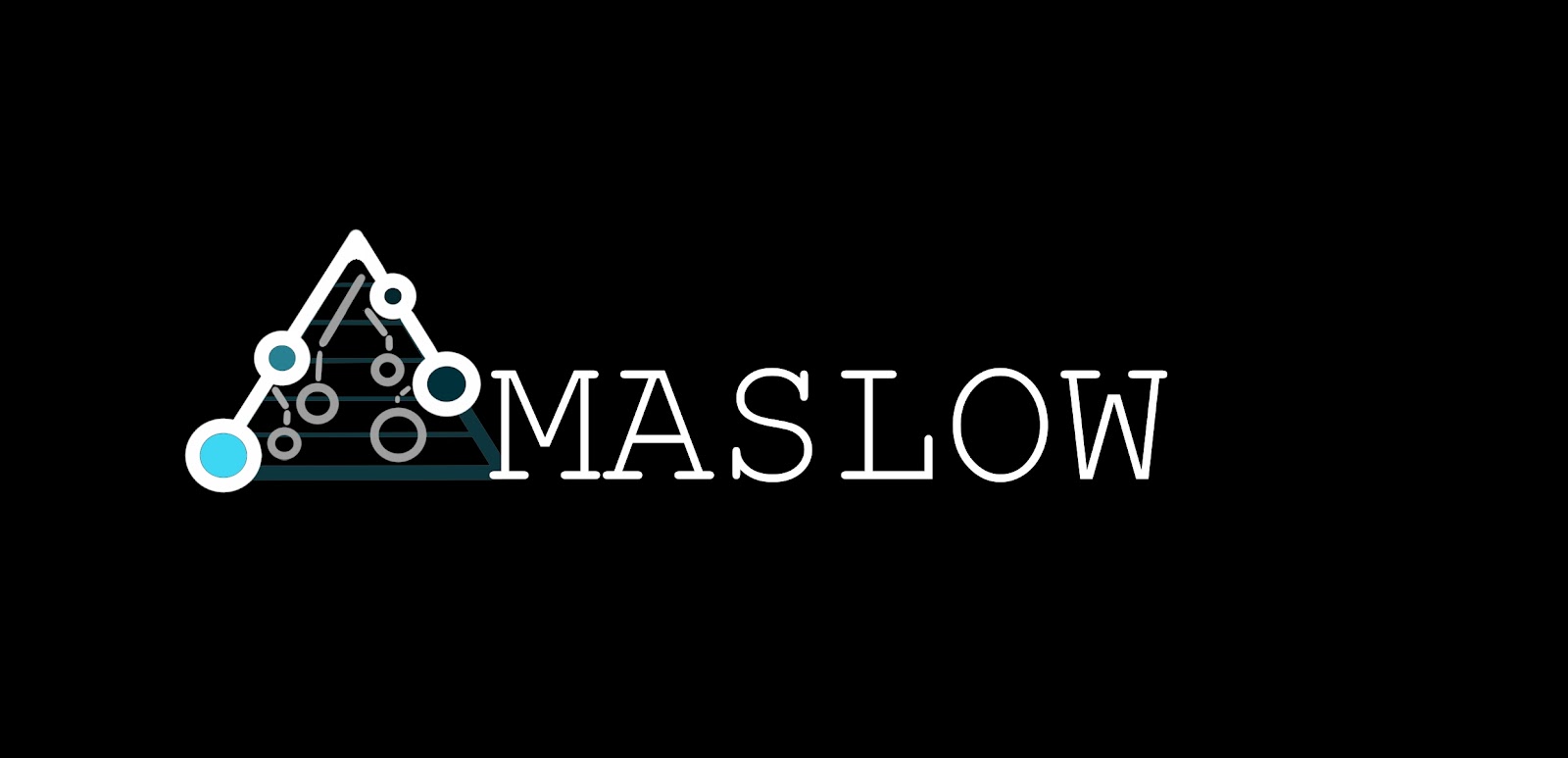
MASLOW is a technological company that seeks to help and enhance the needs of human beings. How did we come to this decision on name? Our name is based on the psychologist and economist Abraham Maslow who was active throughout the early and mid 1900's. Maslow produced a diagram and study that is used in every business studies class across the world, Maslow's Hierarchy of Needs. This Hierarchy of needs is a theory which explores five levels of human needs and motivation and is often depicted within a pyramid. (Below)

Maslow's research uncovers just what it takes for a person to feel accepted, respected and understood enough to survive and thrive. I takes us through levels such as physiological needs, these include our basic needs for survival, food, water, shelter, sleep. And leads us up to areas such as Belonging and Esteem, where an individual is established, loved, accepted, recognised. With our app, The Happy Place, we portray our desire to see people reach the top of Maslow's Hierarchy of Needs - Self-Actualization. At this level, a person feels as best as they can be, they can do anything they put they're mind to and they will find this fulfillment, in their happy place.
Below are some concepts I created as rough promotional posters for the business and campaign. The one on the left features a google cardboard headset which is the primary piece of VR equipment we wish to use with our project. We feel this is accessible and could mean our project is viewed by more people in a more affordable and available way. The image on the right is a play on the fact our project is based is a diner and so the company logo floats on the top of a mug of coffee.


Based on the posters I created, I produced a GIF image featuring a light infused glitch that when executed, causes the logo and fonts to light up and remain glowing. This gives an edgy feeling and almost a radioactivity sensed vibe. This was fun to create and I think sets the tone for what feelings and emotions we want to led our audience towards.

Research
Cassie Niice - https://niice.co/m/e611f5b4d4eb2be9615ebc19e19d9ba4
Lorna Pinterest - https://www.pinterest.co.uk/lorna_555/final-year-vr/
Megan Niice - https://niice.co/m/5f88ea3ac3f4dced0617dc5224eff335
Thomas Niice - https://niice.co/m/bc4dd96b81a2a2234b09cbcfa0cf6fce
Below is a video created by Lorna which is a screen capture sequence of each of our team member's research pages in this early stage of pre-production -
VR - Live Painting
When it came to initial research, we were interesting in anything involving graphics or art being created within a virtual space. 3D painting and virtual reality painting. Below is a video created in the software Tilt Brush by artist George Peaslee. He was asked by SoulPancake to create famous artworks in a virtual reality space and so the below video, we can see him creating Edward Hopper's "NightHawks" painting. This is an avenue that we won't be exactly using but just to witness to capabilities and final appearance of this style in VR, especially as it is set in a diner/coffee shop will help us by seeing alternative directions and styles for our set and character design.
Augmented Reality
"Strange Beasts" by Magali Barbé is portrayed as a real advertisement for a Augmented Reality Pet app which is linked to an eye piece that is inserted like a contact lens. It tells a good story with quite a few moments of creepiness throughout including the main character interacting with his daughter who, as revealed near the end, doesn't even exist. The AR context of the video intrigued us but also the building up of dialogue and the revelation of creepy moments and narrative.
Game Play -
In addition to looking at virtual painting and creating an uncomfortable dialogue through the narrative, we also wanted to look at game play examples. In the game 'doki doki' the audience are led to believe the game is just like an Asian version of Sims, but what they soon discover is that it is nothing like that at all. Th user is led through horrific circumstances and situations that leave them feeling disturbed and edgy. This false portrayal to an audience is the kind of reputation we desire to achieve through our project. Giving the impression of an enjoyable experience by naming our project the Happy Place but letting our app glitch and fall apart in from of their eyes through various circumstances.
One of the key ways games and feature films create a unnerving and unsettling ambiance within their projects is through the use of natural, raw audio. The use of cries, voices and breathing in the background of a scene can cause the audience member or user of a device to feel in danger, discontent and wanting to leave or get out of a certain place. We will be playing with sounds for the background of our app and this research will definitely help us in achieving the feelings and emotions we wish to draw out. A key example we found was in Hellblade, where the main character Senua is haunted by voices throughout her journey.
Ready Player One -
Ready Player One is set in 2045, when people have the ability to enter into a digital universe called the Oasis. Once there, you can go wherever you want, do whatever you like, be whomever or whatever you choose to be. With the population beset by unemployment, poverty, overcrowding, and utter hopelessness, “it’s a good time to escape into a virtual world where you can live an extraordinary life through your avatar,” according to Director Steven Spielberg. This link gives a good insight into a project we think portrays our ideology in a good way. Seeking out the feeling of happiness and an alternative universe that brings contentment and satisfaction...but it never comes.
https://www.fxguide.com/featured/ready-player-one-inside-the-oasis/
Headspace Videos -
When it came to style, our team member Cassie brought up the videos created by 'Headspace', a company that produces assets and projects to assist and educate people on the topic of mental health and mental well-being. The characters and sets within these projects have a colourful but grainy appearance as an underlying tone. We like this grainy underlay and will be experimenting with it as we approach the beginning of texturing our models and creations.
TED Talk -
We found a TED talk that discussed the topic of computers learning human emotion and being able to effectively interact with us as humans based on their understanding. This will be important for research into our AI Waitress character who will be a humanoid robot seeking to guide and help Happy Place participants have the best experience possible but struggling to meet all the needs of those present.
Another example of this, robot learning human behaviors can be found in the Series 'Suits' when the IT genius Benjamin creates a computerized and compact version of Harvey Specter's secretary Donna.
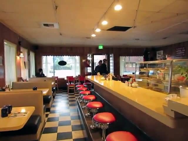
Twin Peaks
When it came to examples of environments that we wanted to use to base our diner designs from, we as a team suggested the most common and well know diners that are on TV right now. In the television series' Twin Peaks and Riverdale, diners features which have both a cosy family vibe to them but are also home to dramatic changes in lighting and narrative that really give the shows a new dimension and appeal. Images can be found below of the diners mentioned.
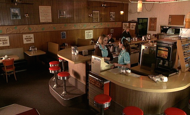

Riverdale


Below is the initial colour palette and birds eye view layout of the diner we are thinking of creating. The use of calm and 'happy' colours will help us to maintain the feeling of belonging for our users. Our hope is to then flip these colours once glitches begin and use more sharp, harsh and threatening colours to contrast this feeling of calm and happiness to fear and uncertainty.


Below is one of a set of images I took while on my travels in the United States. Walking up Las Vegas, Blvd, I was intrigued by this abandoned and rugged looking restaurant. After walking up the demolished drive thru entrance, I soon discovered it was an old abandoned Burger King location. After peaking in to see the interior, I was excited to see diner booths and the use of teal and burgundy within the furniture. I snapped a few photos quickly in case someone came along to kick my off the private property....worth it though! Good primary research for interior environmental design.

Style
For style, we were drawn to cell shading with overlays of different textures to reflect marketing in apps like already mentioned, ‘Headspace.’ This speckled underlay to the textures could help up in creating a much more diverse environment with more depth and personality. Below are examples of some contextual and 3d artist-created pieces of work that we would love to use in piecing together an ideal style and character for our sets and characters.


Cinematography
As our FX overseer and lighting conceptional artist, Cassie was focusing on areas such as cinematography that could be used within our project. She was primarily looking at diner layouts and the camera shots used in various movies such as Grease and Pulp Fiction. SHe has been heavily inspired by the work of Wes Anderson and the majority of her research can be found in her blog post -
https://cassiegallowaygetsadegree.wordpress.com/2018/10/06/week-2-animatic-exploration/

Characters (Original ideas)


In addition to the characters we have finalised and decided upon, we used to have a fourth character featured within the project - an angry old man. After deliberation and discussion within the team, it was decided that he wouldn't feature in our future developments as he felt out of place and didnt have much influence on the set or narrative.
Below I have included images created by Megan, our character artist and designer. In addition to this, I have included her early colour palettes for the young girl and the young man.


Below are examples and concepts created by Lorna in response to the descriptions and character personality we are seeking out from the little girl and the young man. Included are also her colour concepts for these individuals. Lorna also delved into looking at the waitress character design and colour palettes that would maintain the AI personality but still have a 50's retro diner ambiance.


Megan created various hairstyles for the AI Waitress as in her initial sketches, we weren't sure was accurate to what we imagined the waitress to be. She generously created a further 5 concepts of hairstyle for us to choose from and we are now in the process of finalising her look for the beginning of character modelling.
Environment
As the environmental designer and artist for our project, I started by planning out our set and thinking about where each prop could be positioned to allow for a clear, concise and organised narrative to be told. Below is an early sketch created by Lorna to give me an idea of the direction she thinks we are going in relation to the view of our audience during this project. I liked this but wanted to correct areas such as layout and perspective to give myself a more clear and understood mentality for the diner appearance and the view of our audience.
I created the below line art concept for what I imagine the appearance of the diner will be to our app user. Sat as a table with a view of window booths as well as the counter top where our AI Waitress character will be positioned regularly throughout our story. This gives a give or take accurate look at the line of vision for our user and helped us in thinking about props more and the layout and dispersion of characters in the scene.

Lorna used my design to create a thicker, more detailed and more updated version of our diner environment. From here, she was able to go and begin creating colour palettes and beginning to look at the complimentary appeal of diner colours and what would work best for us and our narrative.

In relation to the concepts we had created, I was able to go into the Maya software and begin planning out the location for each piece of furniture and character positions throughout the animated experience. The red ball symbolizes the young girl, the blue symbolizes the young man and the green represents the AI Waitress.


Below is a concept piece I created to get a feel for the table props and models we may need as we approach this stage of our project. Condiments, mugs, napkins and a clock are all items we know will feature in the diner design.

Below are colour concepts produced by Lorna. This was a difficult period of decision making for us as a team as we couldn't quite grasp was colours complimented each other correctly. We feel that now we are pressing towards a final colour design for the environment that each team member is in agreement with.


Below is an image created by Cassie in Adobe Illustrator. It captures the grainy texturing underlay we want to achieve through our style. This will be a great reference for me when I begin texturing the models we have created for the environment.

Below is a layout design I did of the various options we have when it comes to creating a Juke Box. The colours, components and size options are many and so this piece was created to first of all nail down colour and potential design elements.

Glitches
Our glitch coordinator, Cassie, created the following two images. The first shows a partially raw meshed model in a state of almost falling apart and decaying. This is a really fun and impressive concept and it will be interesting to see if we can implement it into the final piece of our work. Secondly, Cassie created a GIF glitch test featuring a common diner scene at a table but in between the glitches, we see a bloody hand print left to create an unnerving and uncomfortable feeling to the onlooker. We hope to achieve more detailed examples of this throughout our piece.


Lastly is a concept I created based on one of the scene within the script we created. The young man's coffee spills over and instead of liquid coming out and flowing, a bundle of ants/bugs come out and disburse. This is a huge glitch within the scene and will play a key part close to the end of our viewers experience.

Storyboards
Lorna took our concepts and script and pieced together a storyboard for us so we could visually start to put our words and thoughts into view. The storyboards she created were great and after doing her second draft, Lorna was able to pass these images onto Cassie we set about producing our first animatic sequence. Lorna, Cassie and myself created audio for the animatic (unsuccessfully) which helped us start to plan timings and room for glitches and key dialogue positioning.

Organisation
As we enter week 4, we as a team are beginning to think about models and getting our project officially up and running in relation to software and 3D design. We will be using our onedrive, Facebook and google drive accounts to help us stay in coordination with each other and see that each task we set out both team based and individually, will be met and dealt with on time or within a sensible time frame to ensure we are on track to meet our deadline by the end of the year
Early GANTT Chart -

From here, it is a matter of continued strong communication and development for us as a team, as we enter into a more software based area of work, we plan to continue to have our regular meetings throughout the week to ensure we are on the same page and each team member has a good idea of the direction and mission of the team. More to follow in the coming weeks.
Comments
Post a Comment