With our project continually being developed, the overall look and final design or our story and project personality are being gradually more understood. With this being the case, it is time for us to begin looking at creating promotional images and visuals that can be used to highlight, explain and raise awareness for our project.
Two of the main ways we aim to do this is through the use of a project poster and social media. Using components from our narrative and scene, we hope to create a poster that symbolises our project in a clear, intriguing and professional way. And in relation to social media, we plan to use Facebook and Instagram as our two main avenues of outreach.
For our poster designs and concepts, our team we very split and individual when it came to style, layout and content. Some of us wanted to pursue more of the sci-fi chaos of our project, while others wanted to maintain a happy place vibe for the poster. It was clear that a lot of communication, concepts, meetings and decisions would need to be made in the creation of our poster.
Some early concepts from Cassie are shown below to give an idea of our thought processes going into this design period -

As a group, we began to discuss the use of one main environmental asset in the poster. This means the poster is clean, easy to layout and easily read by a viewer. Early suggestions were the chair, mug, booth or sauce bottles. The chair was quickly discredited due to the fact we were replacing our chairs with benches in the scene. The mug seemed to be the favourite from the start and we began making concepts in relation to this. Below is a screenshot we have been using of one of the mugs from our scene so we can create a realistic representation of the mugs from the project in the poster.


It addition to the drip, we started thinking about the inspirations we were using for initial designs. We were studying double narrative illustrator, Olly Moss, who is renowned for creating imagery within imagery for large motion picture releases. He takes the concept of silhouette and revolutionised it in a a way that portrays it less as a dark imagery but rather a frame into a situation or scene. Some examples of his work are given below -


We found Moss' poster on protecting the forest quite a nice colour style. Almost like a fuzzy, yet mystical and eery vibe. This is the kind of feel we want our poster to give our viewers.
As part of our research, we also looked at the style of retro diner posters that are usually used as decoration on the diner walls. These were a help in helping us solidify our decision to have one main and focused asset such as the mug within the poster.


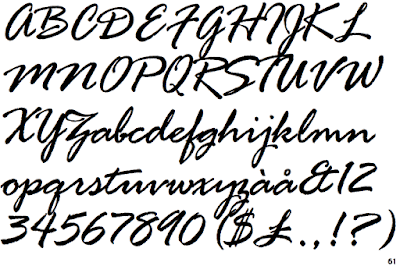
When looking at Typography we used Adobe fonts, dafont and various other typography sites to help us in getting a font that was retro in design but complimented the sci-fi assets within our poster design. We took old poster and placed the fonts into font readers online to try to figure out what fonts were used. Unfortunately, when we placed these in our poster they looked out of place and hard to read. With this, we went on the search for a new font that not only looked good but also found favour with all members of the team. Below are some of the options we were looking at -
After debating over fonts for some time, we soon started to use a font or fonts that were close to, the Microsoft font, 'Rage Italic'. It gave a diner feel but also incorporated well to the other assets present in our designs.
As our poster develops, we are conscious that our narrative features both the order and chaos. With this in mind, we need to ensure that our poster displays both of these and not just one as this could be misleading to the content of the project. In relation to this, we have now considered and will create concepts featuring cracks, spills, glitches, fuzziness and unloading geometry to give a new dimension and edge to our poster designs. Below are some reference images we have used to guide us in this period of design -


Megan made a list of components we wanted to continue developing but wanted to create our own concepts using these points. This would mean that although we would have four different designs, all of these assets would be present and from here we could integrate and chop and change pieces of each others work.

Below are concepts created within our team that were created after these notes were implemented into each persons work. The glitching, colours and spill have all been features we are developing and enhancing to ensure they are clean, easily read and don't lead to confusion.


Cassie took the designs created and started to take the strong points of each poster and implement them into some final draft designs that we will be using as we progress and approach the final printing date of the posters. Below are the two main designs that we will be using moving forward as we get closer to the finalised design for display -


Two of the main ways we aim to do this is through the use of a project poster and social media. Using components from our narrative and scene, we hope to create a poster that symbolises our project in a clear, intriguing and professional way. And in relation to social media, we plan to use Facebook and Instagram as our two main avenues of outreach.
For our poster designs and concepts, our team we very split and individual when it came to style, layout and content. Some of us wanted to pursue more of the sci-fi chaos of our project, while others wanted to maintain a happy place vibe for the poster. It was clear that a lot of communication, concepts, meetings and decisions would need to be made in the creation of our poster.
Some early concepts from Cassie are shown below to give an idea of our thought processes going into this design period -

As a group, we began to discuss the use of one main environmental asset in the poster. This means the poster is clean, easy to layout and easily read by a viewer. Early suggestions were the chair, mug, booth or sauce bottles. The chair was quickly discredited due to the fact we were replacing our chairs with benches in the scene. The mug seemed to be the favourite from the start and we began making concepts in relation to this. Below is a screenshot we have been using of one of the mugs from our scene so we can create a realistic representation of the mugs from the project in the poster.

We liked the idea of a drip or disturbance in the coffee that could be used to symbolise the edgy and imperfections that feature in the project. Below is an early reference image we used to gather the impacted and appearance of a drip.

It addition to the drip, we started thinking about the inspirations we were using for initial designs. We were studying double narrative illustrator, Olly Moss, who is renowned for creating imagery within imagery for large motion picture releases. He takes the concept of silhouette and revolutionised it in a a way that portrays it less as a dark imagery but rather a frame into a situation or scene. Some examples of his work are given below -


We found Moss' poster on protecting the forest quite a nice colour style. Almost like a fuzzy, yet mystical and eery vibe. This is the kind of feel we want our poster to give our viewers.
As part of our research, we also looked at the style of retro diner posters that are usually used as decoration on the diner walls. These were a help in helping us solidify our decision to have one main and focused asset such as the mug within the poster.


When looking at Typography we used Adobe fonts, dafont and various other typography sites to help us in getting a font that was retro in design but complimented the sci-fi assets within our poster design. We took old poster and placed the fonts into font readers online to try to figure out what fonts were used. Unfortunately, when we placed these in our poster they looked out of place and hard to read. With this, we went on the search for a new font that not only looked good but also found favour with all members of the team. Below are some of the options we were looking at -
 |
| Milestone by Ramandhani Nugraha |
 |
| Retrology Font - by Letterhend Studio |

As our poster develops, we are conscious that our narrative features both the order and chaos. With this in mind, we need to ensure that our poster displays both of these and not just one as this could be misleading to the content of the project. In relation to this, we have now considered and will create concepts featuring cracks, spills, glitches, fuzziness and unloading geometry to give a new dimension and edge to our poster designs. Below are some reference images we have used to guide us in this period of design -


Megan made a list of components we wanted to continue developing but wanted to create our own concepts using these points. This would mean that although we would have four different designs, all of these assets would be present and from here we could integrate and chop and change pieces of each others work.

Below are concepts created within our team that were created after these notes were implemented into each persons work. The glitching, colours and spill have all been features we are developing and enhancing to ensure they are clean, easily read and don't lead to confusion.


Cassie took the designs created and started to take the strong points of each poster and implement them into some final draft designs that we will be using as we progress and approach the final printing date of the posters. Below are the two main designs that we will be using moving forward as we get closer to the finalised design for display -
Comments
Post a Comment